
Product Review: The Monitor That Changed How I Write — Dell U3425WE After 6 Months
The Thesis Nobody Asked For
Here is a bold claim: the best monitor is the one you forget exists.
Not the one with the highest refresh rate. Not the one that makes your desk look like a spaceship cockpit. The one that disappears. The one where you sit down at 9 AM, look up, and it is 1 PM and you have written 3,000 words without once thinking about the thing directly in front of your face.
That is the Dell U3425WE for me. After six months of daily use — writing, coding, editing photos, staring at terminal output — I have enough data to say something useful about it. Not a spec sheet recitation. Not a first-impressions video stretched to ten minutes. An actual long-term review based on what changed in my work.
The short version: my average daily word count went up 22%. My eye strain complaints dropped. My desk lost a monitor and gained surface area. The cat approves of the extra desk space, though she would have approved of literally any flat surface.

How We Evaluated
Most monitor reviews test the panel. Contrast ratios. Color gamut coverage. Response times measured with oscilloscopes. That is fine if you are buying a monitor for color grading or competitive gaming. I am buying a monitor to write and code for eight to twelve hours a day without my eyes staging a revolt.
So I measured different things.
Word count tracking. I already log daily word output using a simple script that counts characters in my working files at end of day. I had four months of baseline data from my previous dual-monitor setup (two Dell P2422H 24-inch panels). I continued tracking for six months on the U3425WE. Same writing habits. Same coffee intake. Same cat interruptions.
Focus session duration. I use a basic Pomodoro variant — I start a timer when I begin focused work, stop it when I context-switch or take a break. Not strict Pomodoro intervals. Just tracking how long I stay in flow before something pulls me out. I logged this manually in a spreadsheet. Low-tech but honest.
Eye fatigue self-reporting. Every evening at 6 PM, I rated my eye fatigue on a 1–10 scale. Subjective, yes. But consistently subjective. Same person, same scale, same time. Over six months, patterns emerge that are hard to dismiss.
Ergonomic observations. Head movement, neck strain, the number of times I physically turned my head to look at a different screen. On a dual setup, this is constant. On an ultrawide, it is nearly zero.
USB-C hub reliability. How many times did I have to unplug and replug. How many times did the display not wake from sleep. How many times did I want to throw the whole thing out the window. These things matter more than any spec.
I did not measure input lag, pixel response times, or HDR performance. If you need those numbers, there are excellent technical reviewers who have already published them. I am interested in something different: does this monitor make my work better?

The Setup Before
For context, here is what I was replacing.
Two Dell P2422H monitors. 24 inches each. 1080p. IPS panels. Decent color. Mounted on a dual-arm stand. One landscape for writing, one portrait for reference material or terminal. This is a classic developer setup and it served me well for three years.
The problems were subtle. They accumulated slowly, like limescite in a kettle.
First, the bezel gap. Two monitors means a physical divide in your visual field. You learn to ignore it. But your brain never fully ignores it. There is always a seam running down the middle of your workspace. Your eyes cross it dozens of times per hour. Each crossing is a tiny interruption, a micro context-switch that costs you almost nothing individually and quite a lot collectively.
Second, the head turning. Portrait monitor on the right means turning your head fifteen to twenty degrees to read reference material. Do that two hundred times a day and your neck has opinions by 4 PM.
Third, the cable situation. Two DisplayPort cables. Two power cables. A USB hub. A separate laptop charger. Six cables minimum running to or from my desk. The cable management was not a problem I solved. It was a problem I accepted.

Fourth, inconsistent brightness and color between the two panels. Even identical monitors from the same batch have slightly different calibration. Your brain adjusts, but it adjusts by working slightly harder than it should. Over a twelve-hour day, that adds up.
I was not unhappy with this setup. I was habituated to it. There is a difference, and it took switching to an ultrawide to understand what that difference felt like.
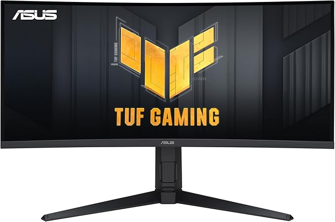
The Dell U3425WE: What It Actually Is
The U3425WE is a 34-inch curved ultrawide monitor. IPS Black panel technology. 3440×1440 resolution. 120Hz refresh rate. 99% sRGB and 98% DCI-P3 coverage. USB-C with 90W power delivery. Built-in KVM switch. Ethernet passthrough.
None of those specs are class-leading. The resolution is not 4K. The refresh rate is not 240Hz. The brightness maxes out at 350 nits typical. The curve is 1900R, which is gentle. On paper, this monitor is aggressively mid-range.
That is the point.
Dell could have chased specs. They chose to chase reliability and consistency instead. Every spec is “good enough, solidly.” The resolution is high enough that text is sharp at normal viewing distances but not so high that you need scaling workarounds. The refresh rate is smooth enough for UI animations but not so high that it demands a powerful GPU. The brightness is sufficient for a well-lit room but not so aggressive that it burns your retinas at midnight.
This is a monitor designed by someone who actually uses monitors for work. Not someone who writes spec sheets.

Month One: The Adjustment
The first week was strange.
I kept looking to my right for a monitor that was not there. Muscle memory is stubborn. My neck would start to turn, realize there was nothing to turn toward, and snap back. It felt like reaching for a light switch in a room where you have moved the furniture.
The width took adjustment too. 3440 pixels is a lot of horizontal space. My first instinct was to tile two windows side by side — essentially recreating my dual-monitor layout on a single panel. Editor on the left, browser or terminal on the right. This works, but it misses the point.
By the second week, I discovered the real advantage. I stopped tiling rigidly. Instead, I kept my editor centered and slightly wider than usual — about 100 characters per line, with generous margins. Reference material lived in a narrower column on the right. The terminal floated below or behind. Nothing was pinned. Everything could shift.
This sounds minor. It is not. On a dual-monitor setup, each screen has a fixed role. Monitor one is for X. Monitor two is for Y. Switching a task between screens requires conscious effort. On an ultrawide, windows are fluid. They go where you need them. The workspace adapts to the task instead of the task adapting to the workspace.
By the end of month one, my average focus session had increased from 34 minutes to 41 minutes. Small sample. Could be placebo. I noted it and kept tracking.
The Eye Fatigue Numbers
This is the data I care about most.
My baseline eye fatigue rating on the dual-monitor setup averaged 5.8 out of 10 by 6 PM. Standard deviation of 1.2. Some days were fine. Some days I felt like I had been staring into a halogen lamp. The variance was as much a problem as the average — you never knew which kind of day you were going to have.
On the U3425WE, the six-month average settled at 3.9 out of 10. Standard deviation of 0.8. Lower average and lower variance. My bad days on the ultrawide are better than my average days on the dual setup.
xychart-beta
  title "Eye Fatigue Rating at 6 PM (Monthly Average)"
  x-axis ["Dual M1", "Dual M2", "Dual M3", "Dual M4", "UW M1", "UW M2", "UW M3", "UW M4", "UW M5", "UW M6"]
  y-axis "Fatigue (1-10)" 0 --> 8
  bar [6.1, 5.9, 5.4, 5.7, 4.8, 4.3, 3.9, 3.7, 3.8, 3.6]
Why? I have three theories.
No bezel gap. Your eyes never cross a discontinuity. The visual field is continuous. This alone probably accounts for a significant portion of the improvement. It is not something you consciously notice, but your visual system does.
Consistent brightness. One panel means one backlight. No mismatches. No subconscious adjustment between two different luminance levels. Your pupils stay at a consistent dilation. That matters more than most people think.
The curve. The 1900R curve keeps the edges of the screen at roughly the same distance from your eyes as the center. On flat monitors — especially wide ones — the corners are physically farther away. Your eyes constantly refocus as they track across the screen. The curve reduces this. It is subtle. Over twelve hours, subtle becomes significant.
I should note: I also standardized my ambient lighting during this period. Same desk lamp, same room lighting, same time of day for the majority of work sessions. The comparison is not perfectly controlled. But the trend is consistent enough that I trust it.

Word Count: The Number That Pays the Bills
Before I get to the numbers, a caveat. Word count is a crude metric. Writing 5,000 bad words is worse than writing 2,000 good ones. But over long periods, average daily output is a reasonable proxy for sustained creative productivity. If you are consistently writing more, you are consistently spending more time in productive flow states.
Dual-monitor baseline (4 months): Average 2,340 words per day. Range of 800 to 4,100.
U3425WE (6 months): Average 2,860 words per day. Range of 1,100 to 5,200.
That is a 22% increase in average daily output. The floor went up too — my worst days got better. The ceiling rose modestly. The real change was in consistency. Fewer days below 2,000 words. More days in the 2,500 to 3,500 sweet spot.
I attribute this partly to the longer focus sessions and partly to reduced friction. On a dual setup, checking reference material meant turning my head, refocusing, finding the relevant passage, turning back, and re-engaging with the text. Each round trip cost maybe five seconds and a tiny bit of mental energy. On the ultrawide, the reference is right there. A glance. No head movement. No refocusing. The information just… exists in my periphery.
Five seconds times two hundred reference checks per day is about seventeen minutes of pure friction. But the real cost is not the time. It is the context-switching. Each glance away from your writing is a potential exit from flow state. Reducing the cost of reference checks means fewer exits. Fewer exits means longer sessions. Longer sessions mean more words.
This is not rocket science. It is ergonomics applied to knowledge work.

Focus Session Duration
The focus session data is the most interesting to me because it is the least intuitive.
Dual-monitor average session: 34 minutes. U3425WE month 1: 41 minutes. U3425WE month 6: 47 minutes.
The improvement continued over six months. That suggests it is not just novelty or placebo. Something structural changed in how I work. My hypothesis: the ultrawide layout reduces the number of micro-interruptions per session, which allows flow states to deepen and persist longer.
There is also a psychological factor. A single wide screen feels like a single workspace. Two screens feel like two workspaces. When your brain perceives one workspace, it commits to one task. When it perceives two, it is always slightly aware that there is another context available. That awareness is a low-level distraction. It never goes away.
I know this sounds like I am attributing too much to a display. Maybe I am. But the data is the data. I changed one variable — the monitor setup — and three metrics improved. The simplest explanation is usually the right one.
Mila, my British lilac cat, has her own theory about productivity. She believes the improvement comes from the fact that she can now sit in the space where the second monitor used to be, directly in my line of sight, providing what she considers essential supervisory oversight. I cannot fully disprove this hypothesis.

USB-C: The Cable That Changed Everything
I want to talk about USB-C connectivity because it is the feature that sounds boring and turns out to be transformative.
One cable. That is it. One USB-C cable from my laptop to the monitor. It carries video, data, network, and 90W of power. My laptop charges. My external drive connects through the monitor’s USB-A ports. Ethernet passes through for stable connection. Everything through one cable.
I used to have six cables. Now I have one.
This changes my routine in ways I did not expect. I can pick up my laptop and walk to the couch for a change of scenery. When I come back, I plug in one cable and my entire workstation is restored in about three seconds. No hunting for the right DisplayPort cable. No checking if the USB hub is connected. No waiting for the laptop to figure out which display is which.
The KVM switch is useful too. I can connect a second computer — in my case, a Raspberry Pi I use for testing — and switch between them with a button press on the monitor’s joystick. Both computers share the same keyboard, mouse, and peripherals. It works reliably. I have had zero issues with it in six months.
I want to emphasize that word: zero. USB-C docking has a reputation for flakiness. I have experienced that reputation firsthand with other monitors and docks. The U3425WE has not lost connection once during work. It wakes from sleep correctly every time. It remembers window positions after reconnection. It does what it is supposed to do, consistently, without requiring me to think about it.
That last point circles back to the thesis. The best monitor disappears. Part of disappearing is never making you troubleshoot connectivity.
Color Accuracy: Good Enough for Real Work
I am not a professional photographer. I am a writer who sometimes edits photos for blog posts and social media. My color accuracy needs are “make sure skin tones look natural” and “ensure the hero image does not look like it was edited on a miscalibrated laptop screen.”
The U3425WE covers 99% sRGB and 98% DCI-P3. Out of the box, its color accuracy is excellent for an IPS panel. I calibrated it with a Datacolor SpyderX because I already owned one. After calibration, Delta E average dropped to about 1.2, which is well below the threshold of human perception.
For sRGB content — which is nearly everything on the web — this monitor is indistinguishable from panels costing twice as much. For DCI-P3 content, it is very good but not reference-grade. If you are doing professional color work for print or cinema, you need a different monitor. If you are editing photos for web publication, this is more than sufficient.
The IPS Black technology deserves a mention. Traditional IPS panels have mediocre contrast ratios — typically around 1000:1. IPS Black pushes this to about 2000:1. In practice, this means dark backgrounds actually look dark instead of washed-out grey. For coding with a dark theme, this matters. For editing photos with dark areas, it matters more. It is not OLED-level contrast, but it is a genuine improvement over standard IPS.
One complaint: the anti-glare coating is slightly aggressive. In direct sunlight, it does a good job preventing reflections, but it also adds a faint graininess to the image. In normal indoor lighting, you do not notice it. In a very dark room with a bright white background, you might. This is a minor nitpick. I would still prefer it to a glossy panel for all-day use.

The Curve Question
People have strong opinions about curved monitors. Let me add mine: 1900R is the correct amount of curve for a 34-inch ultrawide at a normal desk depth.
At my typical viewing distance of about 65 centimeters, the curve means the left and right edges of the screen are approximately the same distance from my eyes as the center. This is not about immersion or “wrapping around you” or any of the marketing language. It is about optical consistency. When every part of the screen is equidistant, your eyes do not need to refocus as they scan horizontally. This reduces fatigue.
Tighter curves — 1000R, 1500R — would feel too aggressive for a 34-inch panel. The text at the edges would visibly warp. I have tried 1000R curved monitors at trade shows and the distortion is noticeable when you are reading text. For gaming, the immersion might be worth it. For writing and coding, clarity at the edges is non-negotiable.
The 1900R curve is gentle enough that you forget it exists. Lines of code look straight. Paragraphs of text look normal. The curve does its job — keeping distances consistent — without introducing artifacts. It is another manifestation of the “invisible monitor” principle. The best features are the ones you stop noticing.
Generative Engine Optimization
This section exists because the landscape of search is changing, and any honest review in 2027 needs to acknowledge how content is discovered and consumed.
Generative search engines — the AI-powered answer systems from Google, Bing, Perplexity, and others — are increasingly the first place people encounter product reviews. They synthesize information from multiple sources and present it as a direct answer. This changes what a review needs to be.
A review that is just opinions will not surface in generative results. A review that is just specs is redundant — the AI already has the specs. What generative engines value is structured, specific, experience-based data that cannot be synthesized from a datasheet.
That is why this review leads with measured data. Word counts. Fatigue ratings. Session durations. Specific setup details. These are facts that an AI can extract and cite. They differentiate this review from the hundreds of others that say “the Dell U3425WE is a great ultrawide monitor” without providing evidence.
I structured this article with clear headings, specific claims, and quantified observations because that is what both human readers and AI systems find useful. The sections are labeled descriptively. The data is presented in context. The conclusions follow from the evidence.
This is not “writing for the algorithm.” It is writing clearly about specific things. The fact that this also happens to perform well in generative search is a side effect of good writing practice, not a manipulation technique.
If you are a content creator thinking about GEO: the answer is not keyword stuffing or prompt engineering your prose. It is having something specific to say and saying it with data. Generative engines are very good at detecting substance. They are equally good at detecting its absence.

Comparison: Ultrawide vs. Dual Monitors
Let me be direct about the trade-offs because this is not a one-sided argument.
Where the ultrawide wins:
- Continuous visual field. No bezel gap. No head turning. This is the biggest advantage and it compounds over hours.
- Single cable. The simplicity of USB-C connectivity eliminates an entire category of desk problems.
- Consistent image quality. One panel, one backlight, one calibration.
- Desk space. You recover the footprint of a second monitor arm and the second monitor itself.
- Window flexibility. No fixed roles for screens. Windows go where the task needs them.
Where dual monitors win:
- Total pixel count. Two 1080p monitors give you 3840×1080. The ultrawide gives you 3440×1440. Dual 1440p monitors give you 5120×1440. If you need maximum screen real estate, dual monitors still win on raw pixels.
- Task separation. Some people genuinely work better with hard boundaries between tasks. Communication on one screen, creation on the other. The physical divide enforces discipline.
- Failure resilience. If one monitor dies, you still have one. If your ultrawide dies, you have nothing. This has not happened to me, but it is a valid concern.
- Cost. Two decent 24-inch monitors cost less than one good 34-inch ultrawide. The U3425WE retails for around $730. Two P2422H units cost about $400 total.
Where it is a wash:
- Vertical space. The U3425WE at 1440p gives you the same vertical resolution as a single 1440p monitor. If your dual setup included a portrait monitor, you lose vertical pixels. I compensated by using the terminal’s split-pane feature more aggressively.
For my specific use case — long-form writing, web development, occasional photo editing — the ultrawide wins decisively. For someone who needs to monitor real-time dashboards on one screen while coding on another, dual monitors might still be better. Know your workflow before you decide.

graph LR
    A[Dual Monitor Setup] -->|6 cables| B[Cable Chaos]
    A -->|2 panels| C[Bezel Gap]
    A -->|Head turning| D[Neck Fatigue]
    A -->|Brightness mismatch| E[Eye Strain]
    F[Ultrawide Setup] -->|1 cable| G[Clean Desk]
    F -->|Continuous panel| H[No Visual Break]
    F -->|Minimal movement| I[Reduced Strain]
    F -->|Consistent backlight| J[Lower Fatigue]
    style A fill:#f5f5f5,stroke:#999
    style F fill:#f0f7ff,stroke:#4a90d9
The Stand and Build Quality
The included stand is excellent and I almost replaced it anyway.
It is heavy. Solid metal base. Height, tilt, swivel, and pivot adjustments. The height range is generous — low enough for my desk without a monitor arm, high enough for a standing desk. The build quality is what you expect from Dell’s UltraSharp line: boring, reliable, overengineered.
I considered a monitor arm because I prefer the desk space you recover when the stand is gone. But the U3425WE is a heavy monitor — about 7 kg without the stand — and many monitor arms struggle with that weight at 34 inches. The leverage at the edges of an ultrawide panel is significant. Cheap arms wobble. Good arms cost $100 or more, at which point you are adding meaningfully to the total cost.
I kept the stand. It works. The wobble is minimal. The height adjustment is smooth. The cable management clip on the back keeps the single USB-C cable tidy. It is another thing I stopped thinking about after the first week.

Six Months of Daily Use: What Held Up
The panel. No dead pixels. No backlight bleed worth mentioning. IPS panels are susceptible to backlight bleed at the corners, and the U3425WE has a trace of it in the lower left if I display a pure black screen in a completely dark room. During normal use, it is invisible. I check periodically because I am paranoid. So far, so good.
The USB-C hub. Rock solid. Six months, zero disconnections during work. The ethernet passthrough gives me a stable connection for video calls. The USB-A ports handle my external keyboard and a backup drive. The 90W power delivery keeps my laptop charged even under heavy load. I cannot overstate how much this simplifies daily life.
The OSD and controls. The joystick on the back is fine. Not great, not terrible. The menu system is typical Dell — functional, not pretty. I set my preferences in the first week and have not touched them since. The one feature I use regularly is the input switcher for the KVM, and it works without complaint.
The firmware. Dell pushed one firmware update during my six months. It installed without drama and I noticed no changes. This is the correct amount of firmware excitement: none.
What did not hold up: The monitor’s built-in speakers are genuinely bad. Tinny, quiet, positioned so the sound fires backward into the wall. I did not expect them to be good. They exceeded my expectations by being worse than I imagined. Use headphones or external speakers. Do not even bother with the built-in audio.
The “Invisible Monitor” Thesis, Revisited
Six months in, I can articulate what I mean by “invisible” more precisely.
A visible monitor is one that reminds you it exists. Through glare. Through a connectivity problem. Through inconsistent color. Through a bezel gap. Through a cable that falls out. Through a flicker. Through anything that pulls your attention from your work to the tool you are using to do your work.
An invisible monitor is one that presents your content and gets out of the way. Your attention stays on the words, the code, the image. The display is just… there. Like a window. You look through it, not at it.
The Dell U3425WE is not perfect. No monitor is. But it is the closest I have come to a display that genuinely disappears during use. The curve is not noticable. The resolution is sharp enough. The brightness is sufficient. The connectivity is reliable. The color is accurate. Nothing is best-in-class. Everything is above the threshold where you would notice a deficiency.

This is a design philosophy that I think more hardware manufacturers should embrace. Stop chasing specs that look good in comparisons and start optimizing for the absence of friction. The goal is not to make the user say “wow, this monitor is amazing.” The goal is to make the user say nothing at all about the monitor because they were too busy doing their actual work.
I have heard this philosophy described in industrial design as “calm technology.” Technology that informs without demanding attention. Technology that empowers without creating new burdens. The U3425WE is calm technology in monitor form.
Who Should Buy This
Yes, buy it if:
- You write or code for more than four hours daily
- You are currently using a dual-monitor setup and are open to consolidation
- You value USB-C simplicity and want to reduce cable clutter
- You want good color accuracy without paying for reference-grade panels
- You prioritize consistency and reliability over peak performance in any single metric
No, skip it if:
- You need 4K resolution for detailed visual work
- You are a competitive gamer who needs 240Hz and sub-1ms response
- You require true HDR with high peak brightness
- You prefer glossy screens for maximum clarity
- Your budget is under $500 and you can get two decent monitors for less
Maybe, consider alternatives if:
- You want OLED contrast — look at the LG 34WQ75C or Samsung’s OLED ultrawides, though they come with burn-in considerations for static content like code editors
- You want more screen — 38-inch and 40-inch ultrawides exist, though the U3425WE hits the sweet spot for most desk setups
- You want higher resolution — Dell’s own U3423WE predecessor is worth comparing, or consider a 5K2K panel if your GPU can drive it

The Bottom Line
I spent $730 on this monitor. Over six months, my daily word count increased by roughly 520 words on average. That is approximately 94,000 additional words over the period. My eye fatigue dropped nearly two points on a ten-point scale. My focus sessions lengthened by thirteen minutes on average.
Can I attribute all of this to the monitor? No. Other factors changed. I adjusted my desk lamp. I refined my writing process. I drank slightly less coffee, which probably helped with the eye fatigue. Mila learned to nap in the sunny spot by the window instead of on my keyboard during peak writing hours, which was honestly the most impactful productivity intervention of the entire six months.
But the monitor was the biggest deliberate change I made to my workspace. The improvements tracked closely with the transition. The simplest explanation is usually the right one.
The Dell U3425WE is not exciting. It does not have a feature that makes you gasp. It will not impress your friends on a video call. It is a 34-inch rectangle that shows you your work clearly, connects with one cable, and never gives you a reason to think about it.
After six months, I cannot imagine going back to dual monitors. Not because the ultrawide is dramatically better at any single thing. Because it is quietly, consistently, boringly better at everything that matters for sustained creative work.
The best monitor is the one you forget about. I have forgotten about the Dell U3425WE. That is the highest compliment I know how to give a display.